18 Coffee | Packaging + Branding
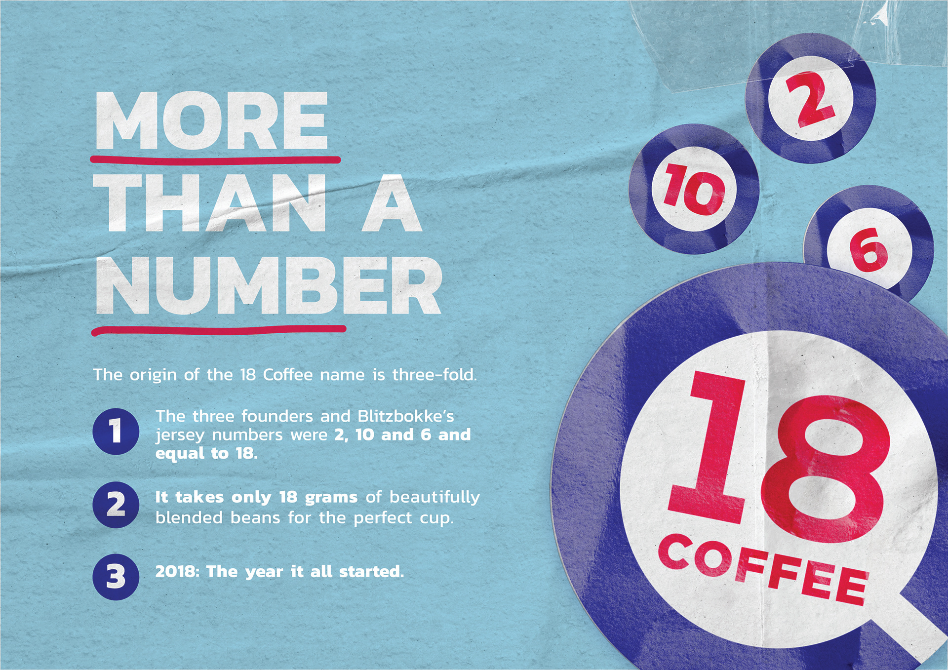
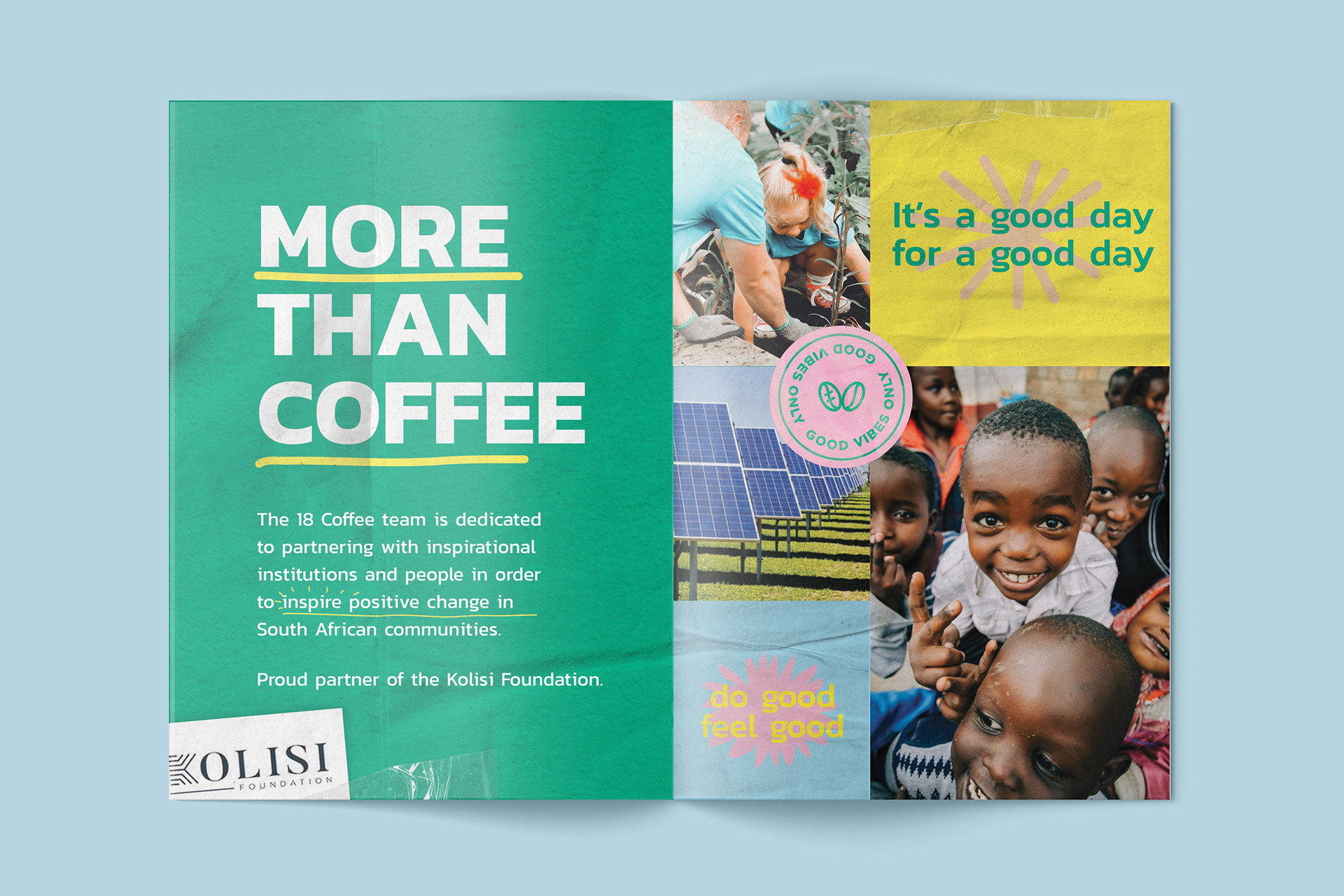
18 Coffee is the brainchild of three iconic South African Sevens rugby players and friends, Philip Snyman, Kyle Brown and Cecil Afrika. Born from a shared passion for coffee and people, 18 Coffee not only brings you a cup of the finest blend, but also the inspiration and authentic connections that come with it.
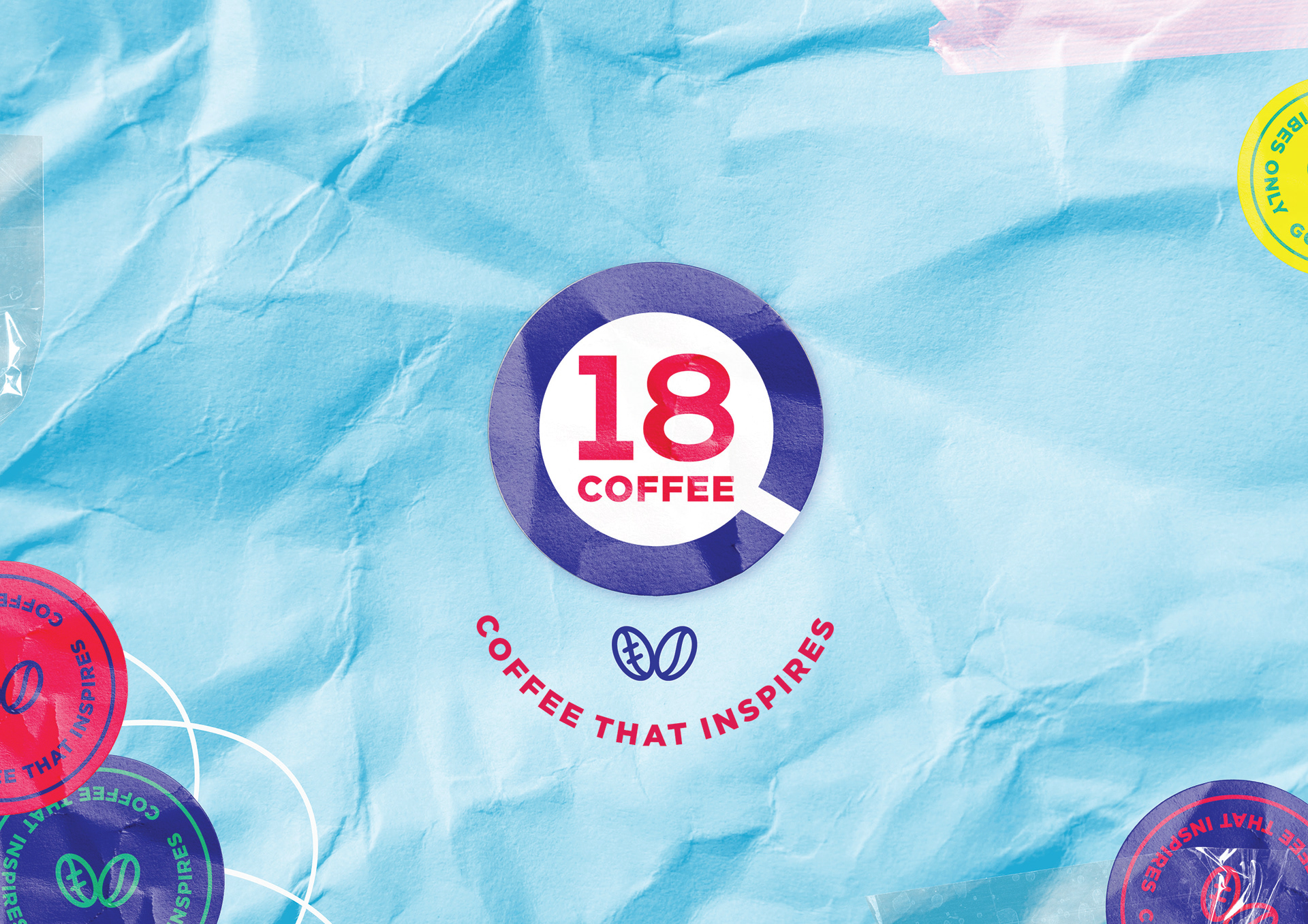
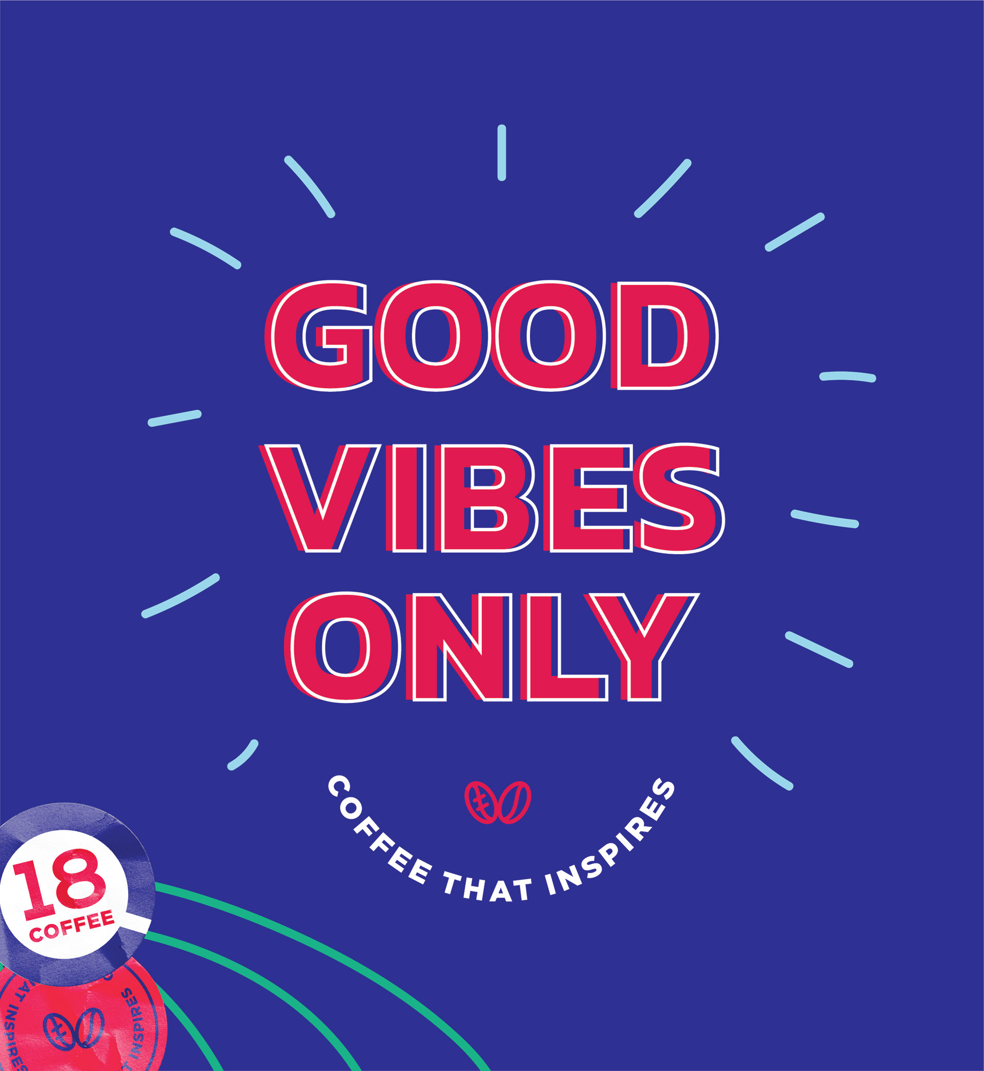
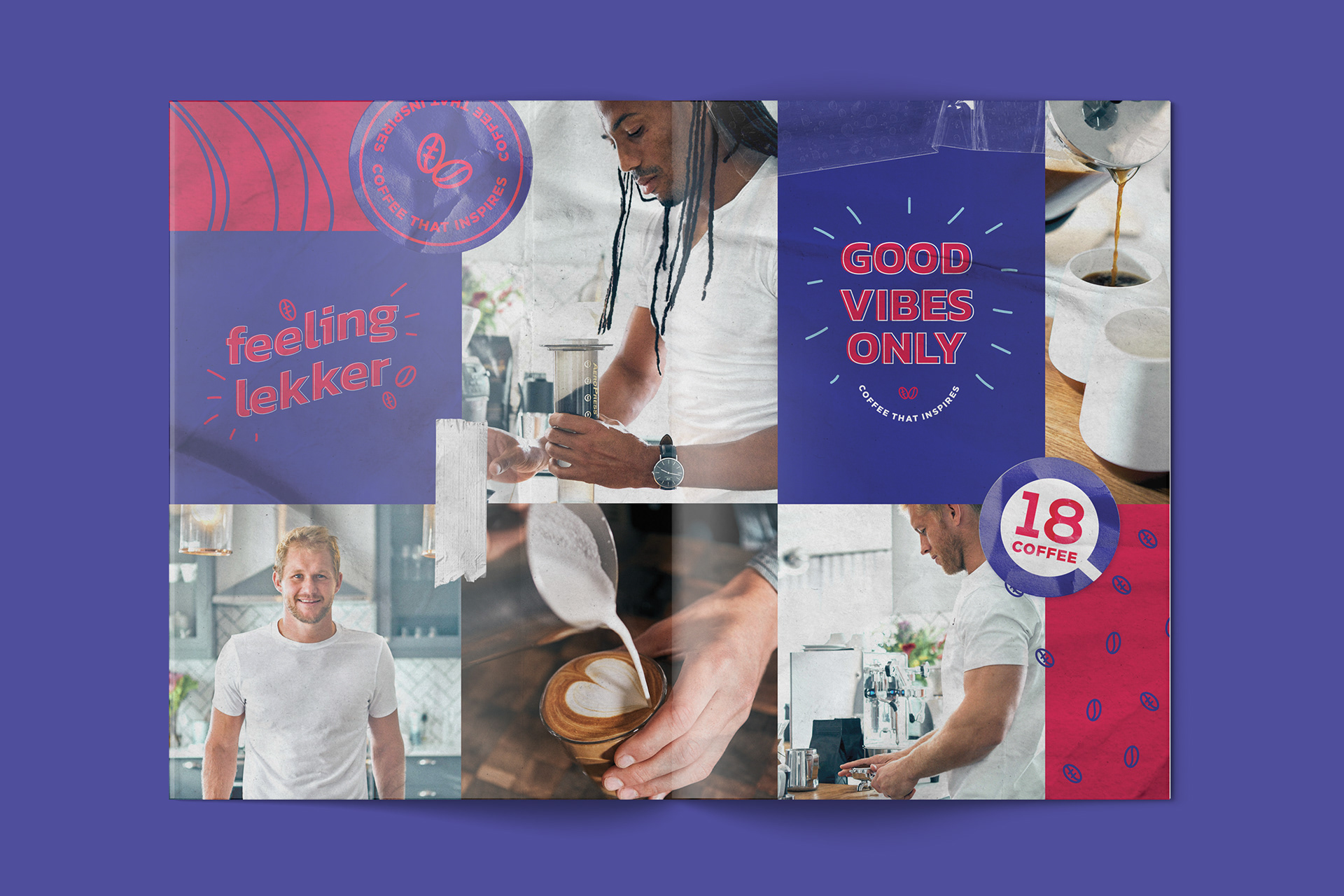
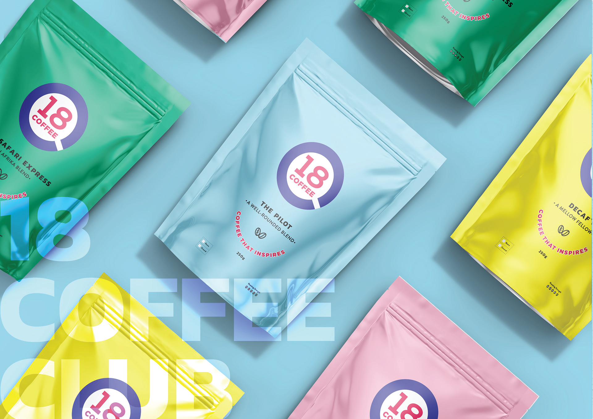
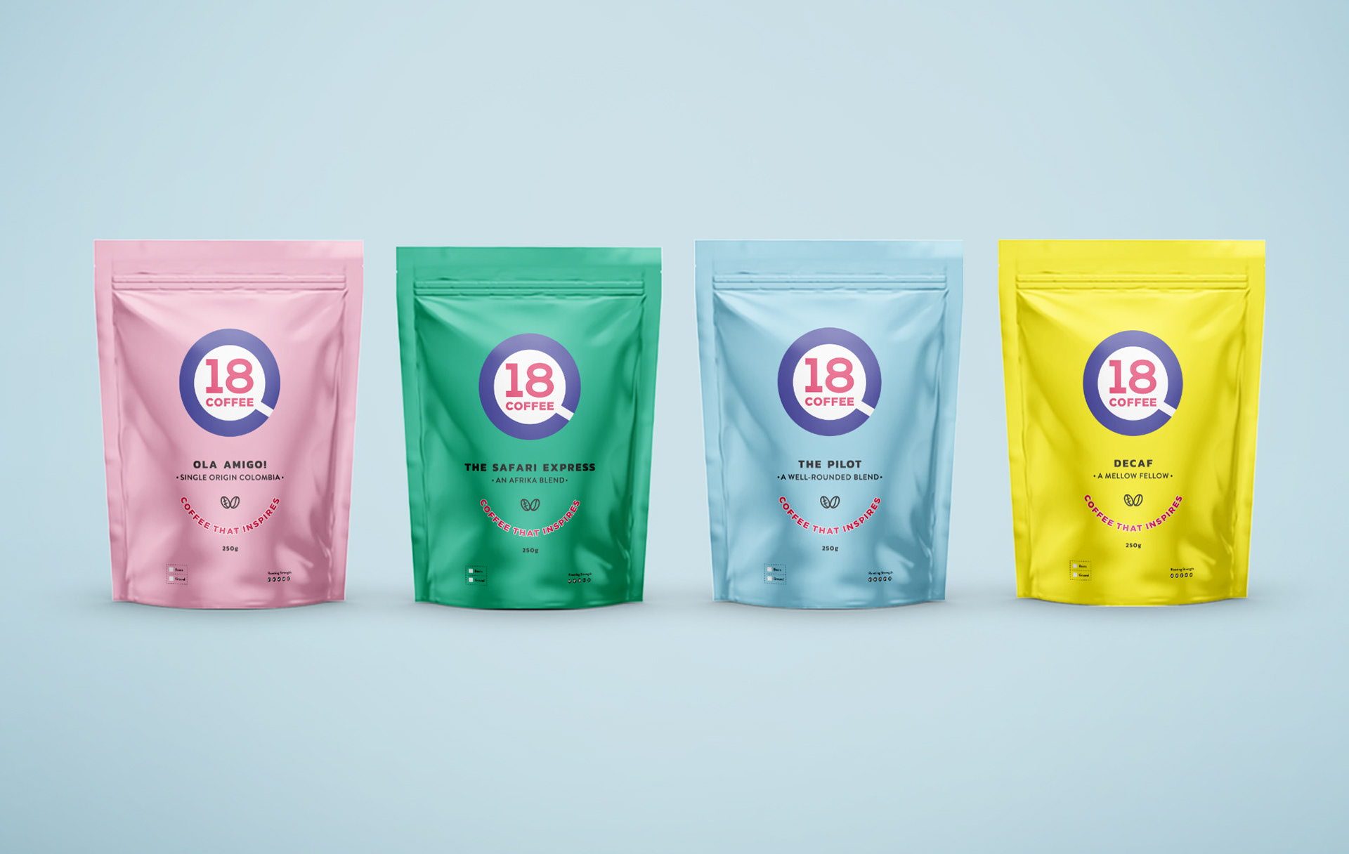
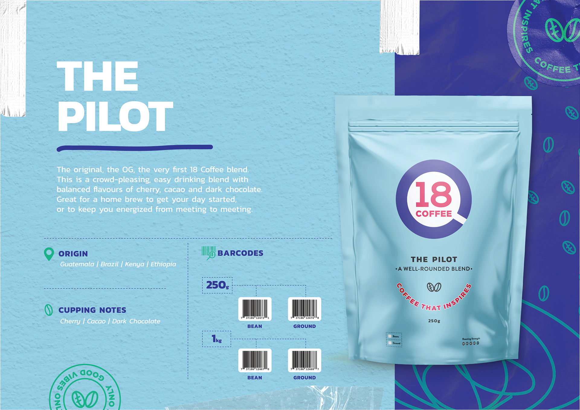
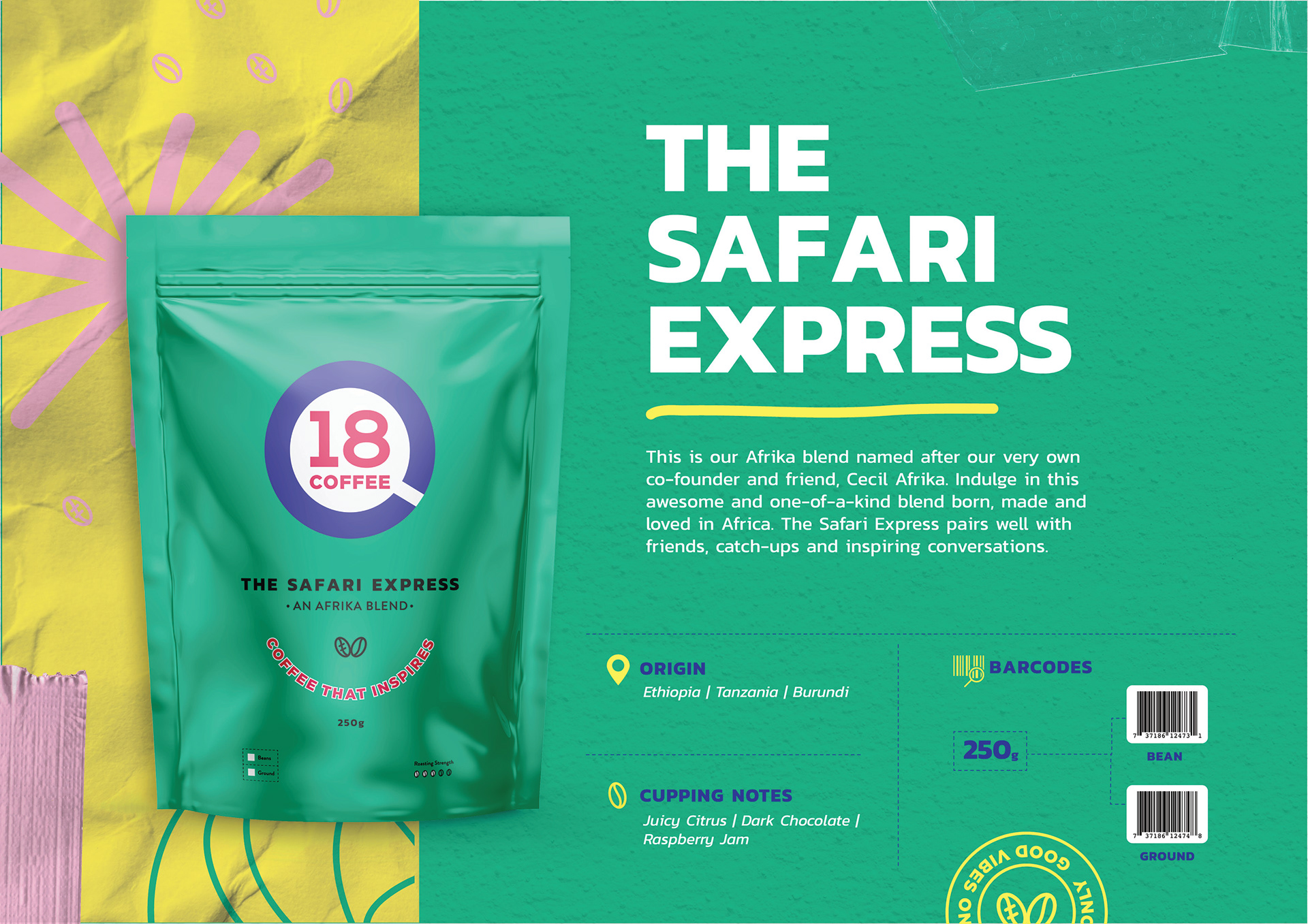
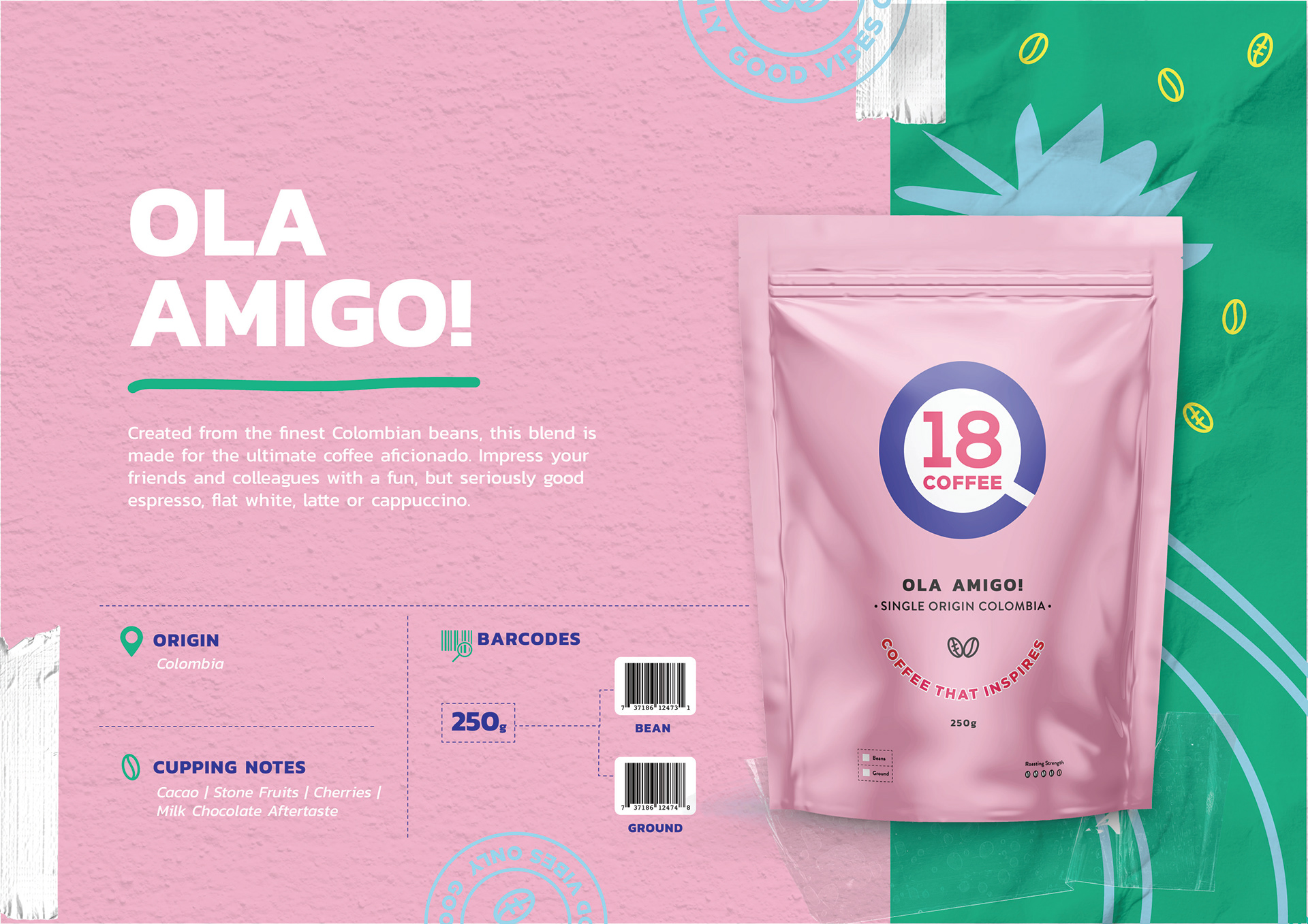
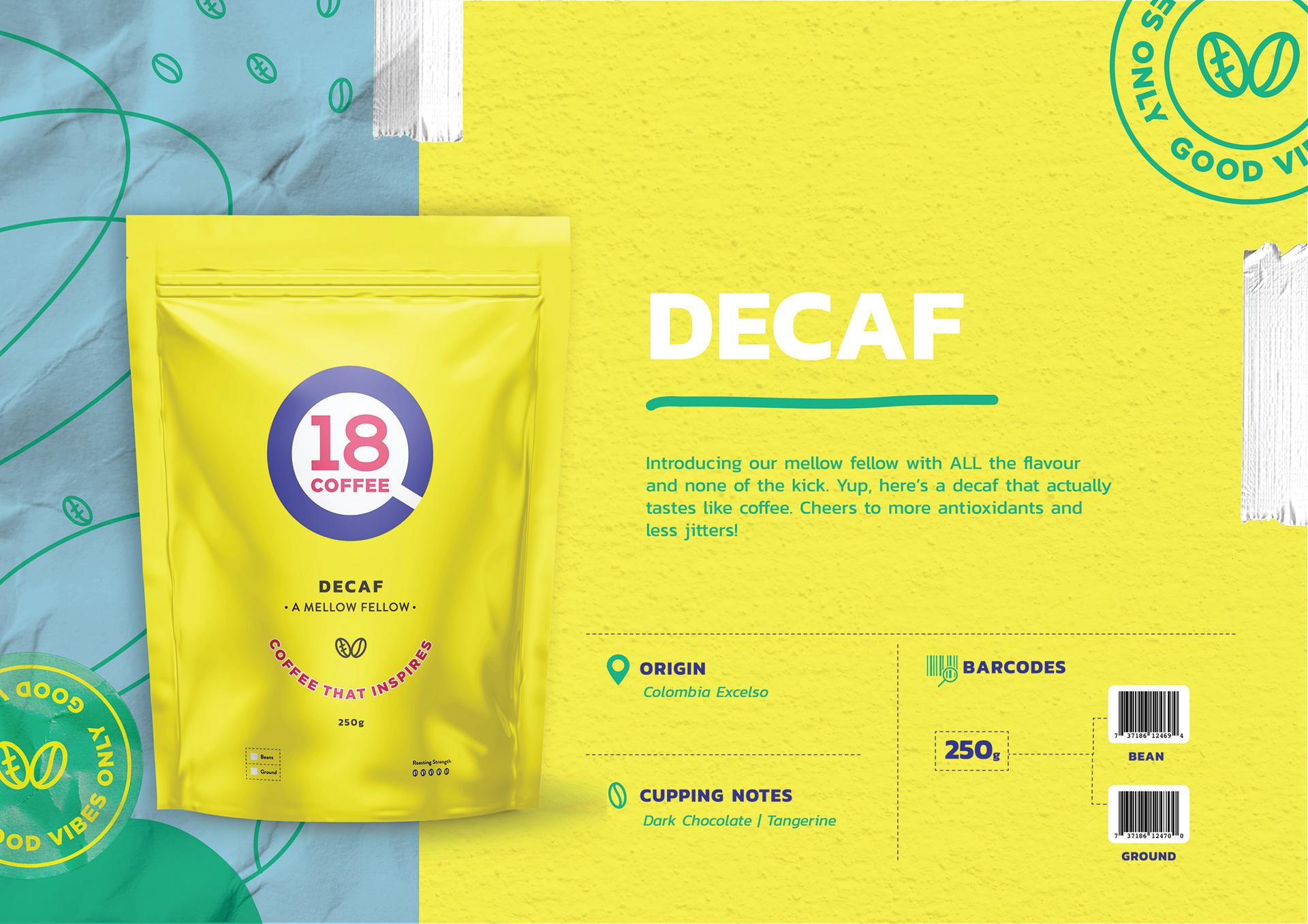
When we started the process of the 18 Coffee brand refresh and packaging update it was very clear that we needed to move the brand from the current dark and heavy branding tone to something that was more aligned to their inspirational ethos. We wanted the brand to be reflective of this light, playful, positive way of thinking so we introduced a new pastel palette and updated the logo to be something simple, clean and punchy. The logo is a subliminal take on coffee as the shape forms a birds eye view of a coffee cup.
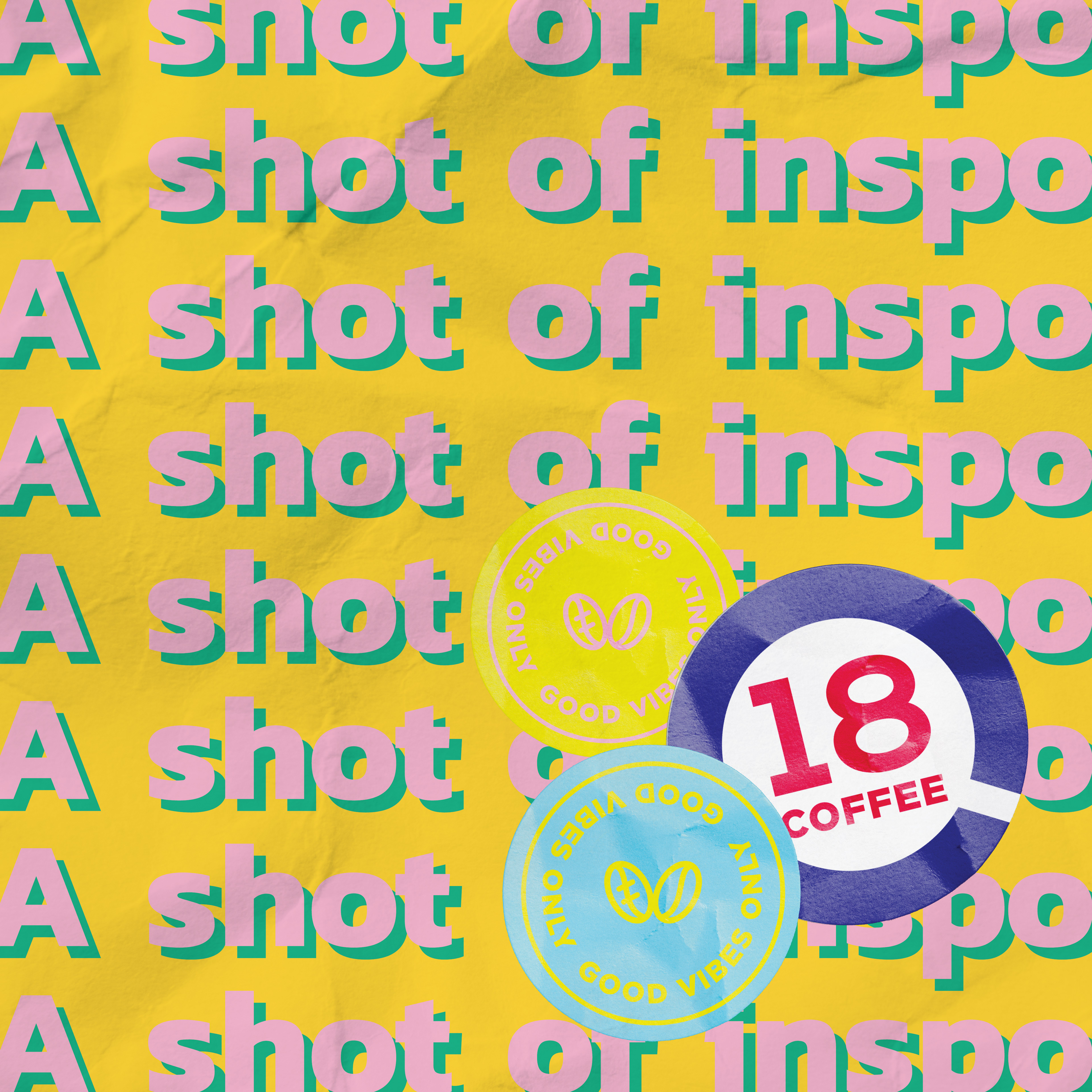
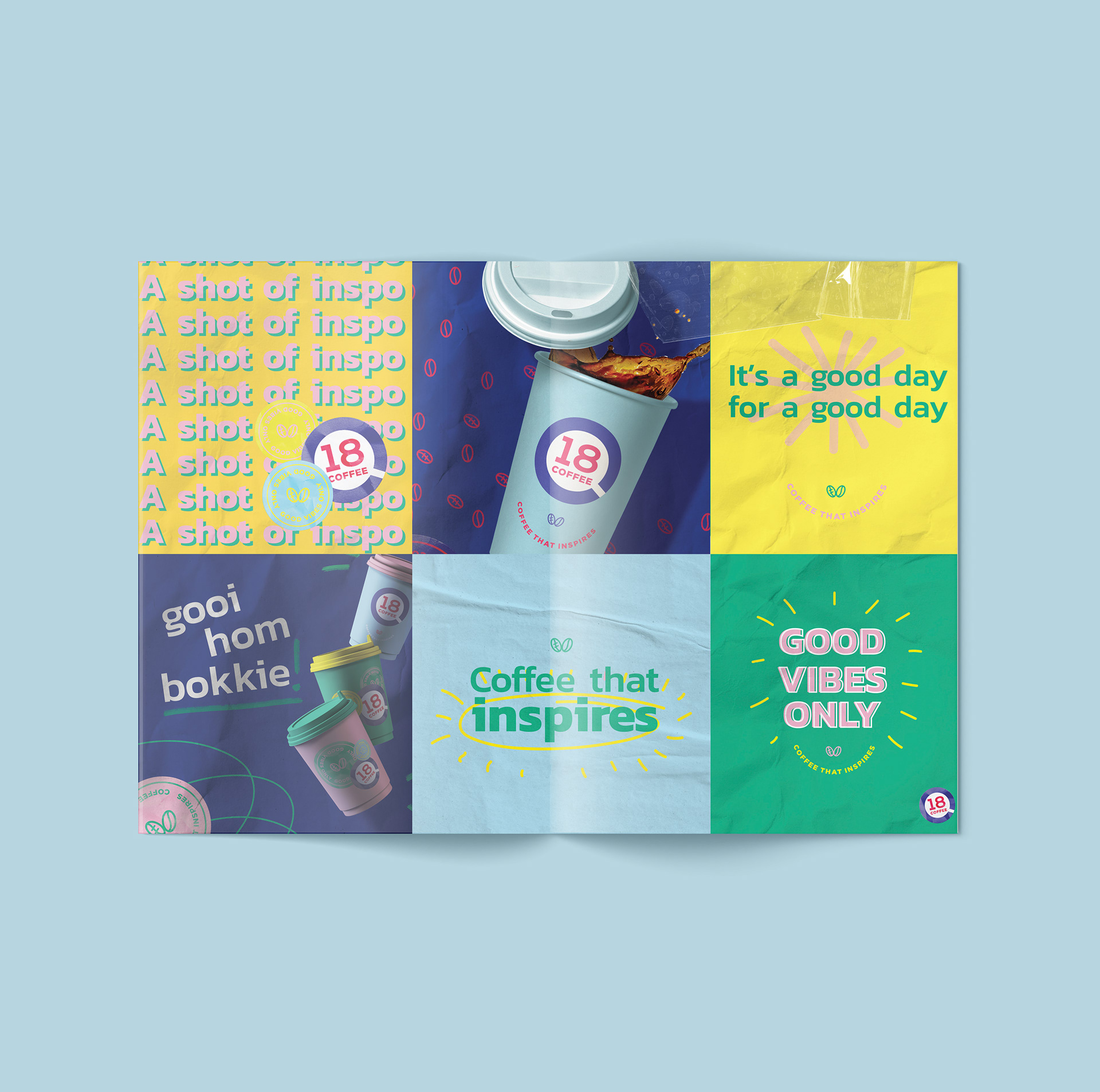
We used various textural elements throughout the design language like scribbles and paper that would further help give life to the concept of ideation, inspiration and authenticity.
Mimicking the process of brainstorming and note-taking, these scribbles and textures are used to bring depth to the ethos of inspiration. It also gives the idea of work-in-progress, that something great is about to happen, and that we don’t take ourselves too seriously.
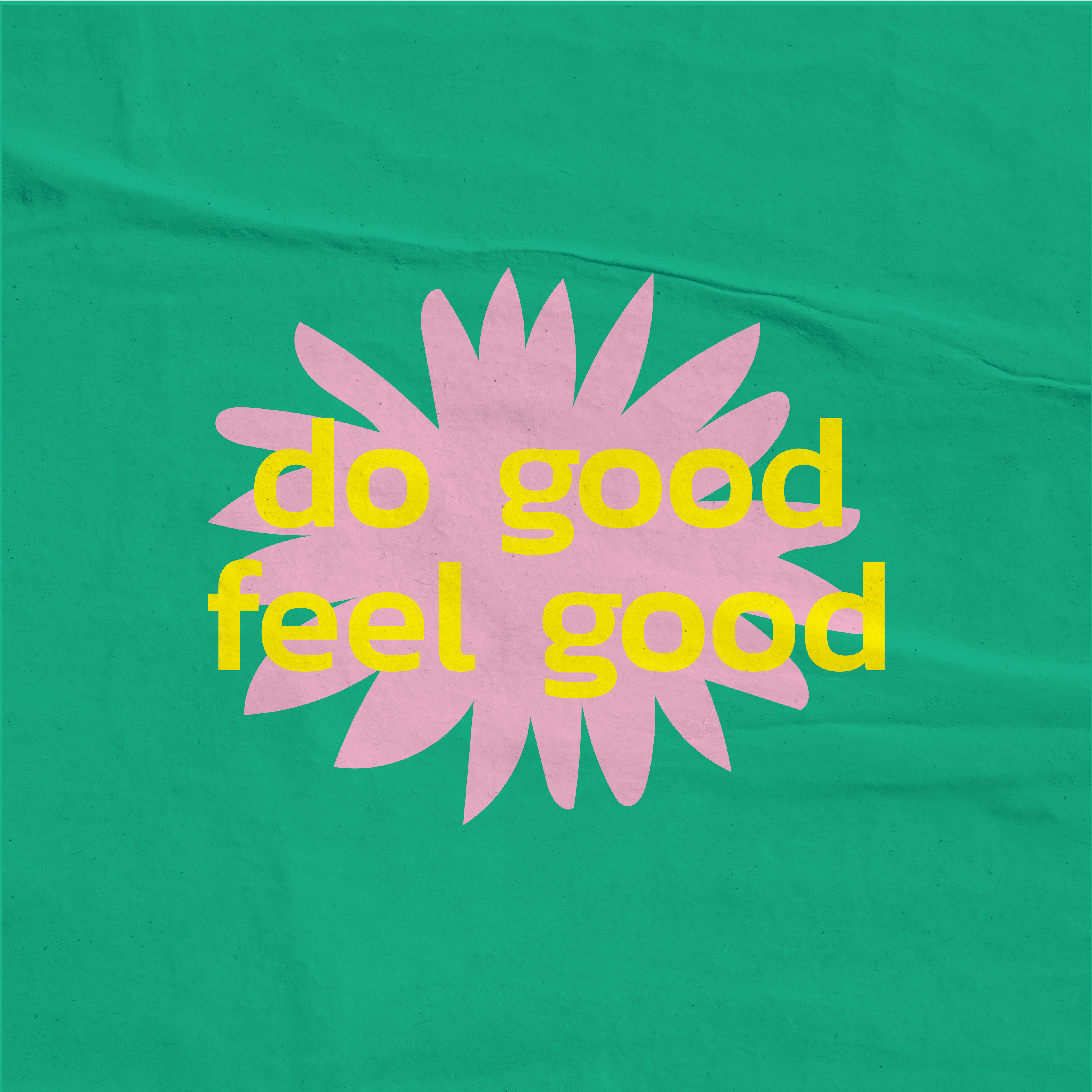
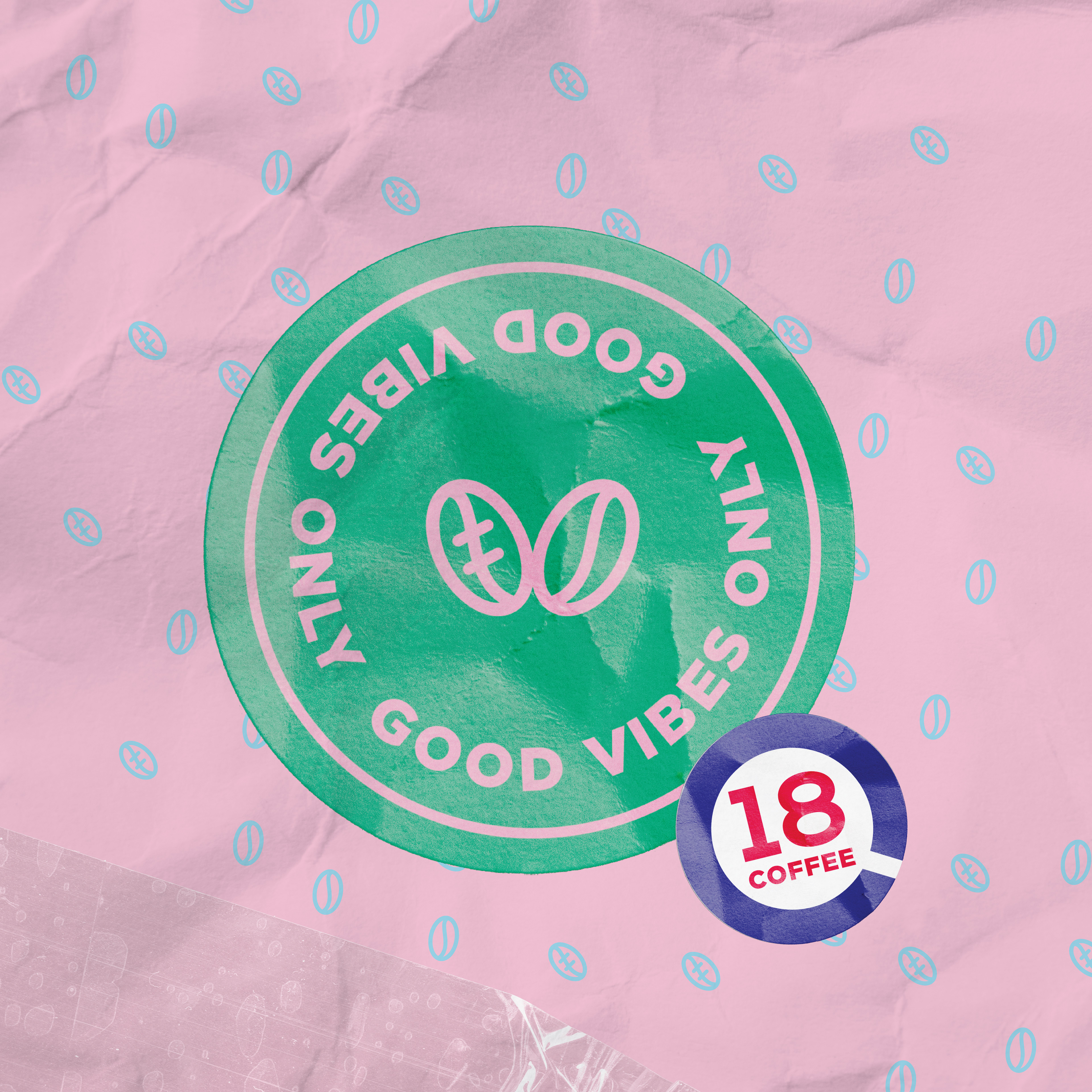
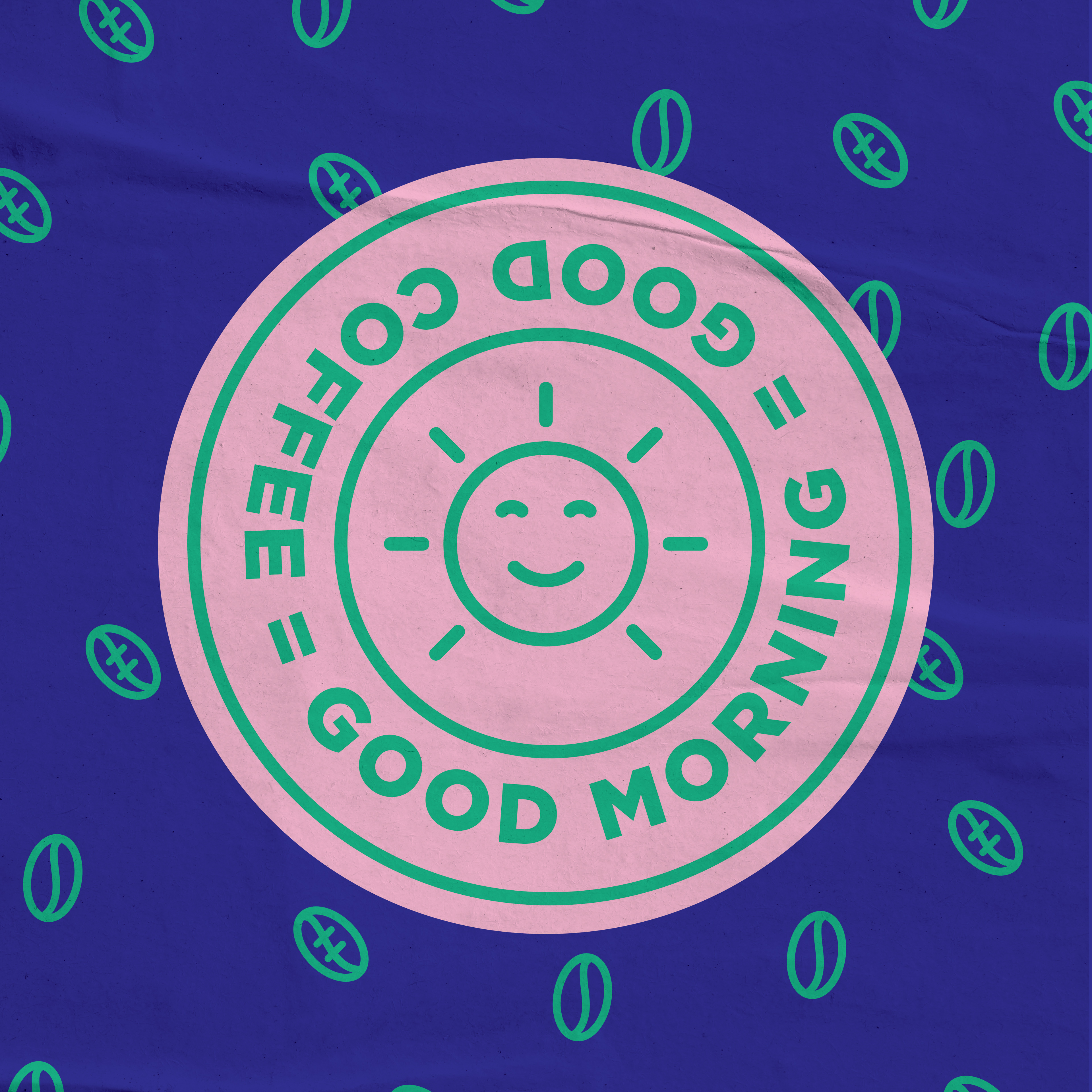
Colloquial terms and fun sayings will keep the brand youthful and relevant, while keeping our followers engaged.
Credits
Client: 18 Coffee
Agency: All These Things
Client Service: Malherbe Pelser
Art Direction/Design: Sarah Gibson
Copywriting + Strat: Marguerite Nel